© Copyright 2025 Mobirise - All Rights Reserved

Prologue

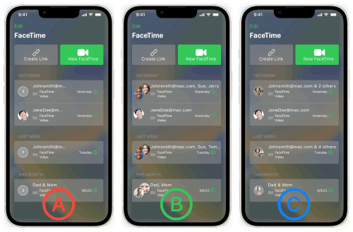
Over the Covid-19 pandemic video calling rose to prominence as a personal and economical lifeline for millions. The increased volume of calls and time spent using FaceTime highlighted one key user pain point: the ambiguity between group calls and single person calls in the dashboard. Pulling from several data sources and collection methods I set out to test my hypothesis and redesign the native app experience.

UX Research Timeline
10 Sec Screen Testing

Users are asked to look at a screen for 10 seconds and answer follow up questions. 

23 Participants
3 Follow up questions
Unmoderated

Preference A/B Testing

Users are asked to select their preferred design from two almost identical screens.

18 Participants
2 Follow up questions
Unmoderated

Usability Testing

Users are asked to complete tasks using prototyped screens and answer questions on their experiences.

12 Participants
5 Follow up questions
Moderated

10 Sec Screen Testing

Using the current FaceTime IOS screen recreated in Sketch.   

Overview
Goals

How distinctive are group calls from single person calls at a glance?

How confident are users at analyzing the FaceTime home screen?

What signifiers do users rely on to filter information?

Questions

How many of the four FaceTime calls displayed are group calls? (three or more people in a call)

On a difficulty scale of 1 (easiest) to 5 (hardest) how would you rate the experience of discerning which calls were group calls?

What clues helped you figure out which were group calls and which were not?

Data Points

The overwhelming majority (83%) of users were not able to filter group calls from single person calls at a glance.

The mean difficulty score was between 3-4. Most found is neutral/slightly hard and yet, only 17% of users were able to correctly filter out the group calls from the FaceTime history.

In the third question users were able to leave comments; most highlighted “Mom” and “Dad” as well as “Icons” and “Names”. The results led me to wonder if users were focusing on the fourth call log on the home screen and missing the other two group calls that had email addresses and more than two icons.

How many of the four FaceTime calls displayed are group calls? (three or more people in a call)

1 Call

%

2 Calls

%

3 Calls 

%

4 Calls

%
On a difficulty scale of 1 (easiest) to 5 (hardest) how would you rate the experience of discerning which calls were group calls?

1 (easiest)

%

2

%

3 (neutral)

%

4

%

5 (hardest)

%

Preference A/B Testing

Using two redesigned FaceTime screens that feature geometric icons and facial/numeric icons.   

Overview
Goals

Do users prefer geometric icons (A) or numeric/facial icons (B) ?

Questions

In which of the two designs is it easier to filter group calls from single person calls?

Can you tell me what feature made you choose one design over the other? 

Data Points

A statistically significant number of users (72%) preferred the numeric/facial icon design (B)

Users highlighted “numbers” and “people” in question two as their rationale for choosing (B) over (A).

At this stage I decided to further pursue numeric iconography over geometric because of overwhelming user preference for numeric icons in both questions.

In which of the two designs is it easier to filter group calls from single person calls?  

A. Geometric Icons (28%)

B. Facial/Numeric Icons (72%)

Usability Testing

Using the preferred design (B) from the previous round of preference testing and two screens inspired by mobile video call competitors Facebook Messenger and Whatsapp.

Overview
Goals

How distinct are group calls from single person calls on the default FaceTime screen time when users are not constrained for time?

What general frustrations do users experience?

Do users prefer a combination of numbers/facial icons or strictly facial icons?

Questions

Are you familiar with IOS, Android, or both? 

What age category do you fall into? 18-25, 26-35, etc. 

Looking at the FaceTime dashboard is there anything unclear to you?

How many calls are group calls? (3 or more people in the call)

Which design best communicates the difference between group and single calls?

Usability Testing

Users overwhelmingly (100%) preferred facial iconography to numeric iconography.

Users highlighted two pain points in their feedback on question 3. These frustrations surrounded the i. Create Link button’s function and ii. Call log history layout.

Users who preferred B highlighted the large facial icons, the limit to two icons for group calls, and the increased text as reasons for their choice.

Users who preferred C highlighted the use of numbers & text in group calls i.e. johnsmith@mac.com & 2 others 

Are you familiar with IOS, Android, or both? 

IOS

%

Android

%

Both

%
What age category do you fall into? 18-25, 26-35, etc. 

18-25

%

26-35

%

36-45

%

46-55

%

56+

%
Looking at the FaceTime dashboard is there anything that is unclear to you?

"Create Link Button"

%

"Nothing"

%

"Too much history"

%
How many calls are group calls? (3 or more people in the call)

1

%

2

%

3

%

4

%

Which design best communicates the difference between group and single calls?

A. Independent Redesign (0%)

B. FB Messenger Redesign (75%)

C. Whatsapp Redesign (25%)

Epilogue

Transition from three faces to two faces for group calls.

Increase icon size for increased readability and accessibility.

Switch from Monochrome IOS iconography to Multicolor to improve visual distinction between group and single calls.

Revise the textual hierarchy (email addresses could be listed last and names first)

Study pain points highlighted by users i.e. call log history, general layout, Create Link button ambiguity.